

I’ve lost count of how many blogs/articles/chapters I’ve read about using paragraph breaks to break up all the type. One of the reasons there are so many is because it’s taxing on the mind, all those big blocks of type. Negative space, the parts of the page free from typography or graphics, is pleasing to the eye. Some authors use paragraph, scene, and chapter breaks more than others. It’s a style choice. But what we can all agree on is that breaks are necessary. There are few books traditionally published in the modern era without them. And so it follows, that if readers appreciate negative space in books, they appreciate it elsewhere, as in every representation of your author brand (with the exception of book covers and related print materials such as bookmarks.) This means your website. This means your e-newsletter. I prefer the term negative space to white space, because strictly speaking, negative space isn’t always white. To me, negative space is graphic- and type-free space that is either white or a lighter shade of another color. Now take a moment and go use your preferred search engine to open the websites of a couple of major brands (the first ones that pop into your head.)
Done? I hope I’ve proved my point, but if you have happened upon a major brand with a cluttered design, they are the exception, not the rule.
It should be noted that for certain genres, readers are used to author websites with less negative space. Science fiction, in my opinion, is one of these genres. And so, depending on which genre you write in, please balance my argument with your readers’ expectations.
The other argument for more negative space is specific to online media. Graphics take 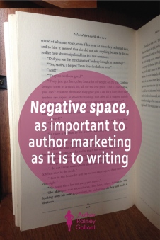 longer to load, so if, for example, your website is weighed down with graphics, it will take longer to load than author sites that have more negative space. And for the online world, every color but white is considered a graphic, so if you’re considering a site that is mostly just a shade of light grey, that will actually take longer to load than white.
What are your thoughts on negative space, whether as paragraph, scene, and page breaks in books, or as a part of an author’s brand? Please share in the comments.
I wrote this post for the monthly Insecure Writers Support Group blog hop. To continue hopping or to join the hop, click here. (There are more than 200 of us, and it’s fun!)

#10 in Elmore Leonard’s succint “Ten Rules of Writing” – Try to leave out the part that readers tend to skip. A takeawy from a meeting of Book of the Month Club editors. What we skip when reading a novel that drags a bit is “thick paragraphs of prose you can see have too many words in them”. The short but complete version of that rule is worth reading. We rarelt skip dialogue, because that is where the story happens. The rest is writerly flotsam. Or “Hooptedoodle” as Steinbeck called it. Yes, possibly required by the writer to fill out the backstory, or the weather or the travelogue bits.
LikeLiked by 1 person
You have such a great memory for writer quotes. Love it!
LikeLike
I notice it mostly when It’s missing! I’ve been reading a few Western authors and they just don’t get the whole idea of separating POVs, scenes, any of it. It drives me nuts.
But, I get used to it and still love the books.
LikeLiked by 2 people
That’s so interesting. I should pick up something in that genre and check it out.
LikeLike
I have a few graphics on my blog, but there used to be three times as many and it helped to clear it up. As for my posts, I always vary it up with images and text. Helps that I’m a man of few words…
LikeLiked by 2 people
Says the writer… 😉
LikeLike
I try to use negative space and I like reading sites that use it because I think it makes the reading easier and less cumbersome
LikeLiked by 1 person
Agree completely. I think your site makes pretty good use of negative space. Sometimes we’re tied down to what our site template allows.
LikeLike
I hate reading long paragraphs on blogs or books. 🌼
LikeLiked by 3 people
There it is. I’ll read a long post, if it’s fun or dialogue or broken up. But lines and lines of blah blah? No way. Thanks for being honest!
LikeLiked by 2 people
Me, too, and now that you say that, I’m wondering if my blog paragraphs are short enough. 🙂
LikeLiked by 1 person
I learned this lesson early on when editing my first book! It helps readers (young and old) not go cross-eyed reading long texts!
LikeLiked by 2 people
Yes!
LikeLike
What is your website address again? I can’t search it on IWSG’s sign-up page.
LikeLike
So agree with you. With my non-fiction writing, I also use heading s and bullet points to break the space up. My eyes glaze over when I read articles without negative space and there are lots of these kind of posts.
LikeLiked by 2 people
Whoever invented bullet points should get some kind of award. 🙂
LikeLike
Great advice – negative space is so important for the brain. We can’t absorb as much detail when things are crowded and unkempt!
LikeLiked by 2 people
I agree completely.
LikeLike
I agree. Fortunately, WordPress puts in white space between paragraphs. Nevertheless, I go back and prune my blog posts before posting, as I do tend to write bushy prose. Happy writing in September!
LikeLiked by 2 people
Bushy prose, lol. Love!
LikeLike
You nailed it, Raimey! As a reader, I greatly appreciate negative space. I often find my mind wandering if forced to drudge through pages of long, descriptive passages. Thanks for the reminder that the same applies to websites. I need to do some housecleaning on my own site and will definitely be looking at it differently. Have a great month!
LikeLiked by 2 people
I was just saying to someone else, that sometimes, us bloggers are tied down, as far as negative space goes, to what our site template allows. I tried to choose one with a lot of negative space, but it’s not as perfect as I’d like it to be!
LikeLike
I went and looked up Red Bull (because I’m addicted to the stuff). I suppose that was a bad example because their header is a moving graphic of videos. But then I looked up Nike and it had the same thing. I suppose anything that’s “you should move” related is going to have moving graphics.
But with regards to reading, I do find myself less exhausted when paragraphs are smaller rather than a wall of text!
LikeLiked by 2 people
I just went and looked both of those up. Nike does have negative space above its main graphic and below as well, whereas Red Bull, well that page is just hard to look at for me. Great examples.
LikeLike
I think I actually blogged about this YEARS ago–how there’s a psychological need for negative space, or white space. I know it’s a point I hit on regularly when critiquing or editing. But then, I’m hugely visual, so it probably bothers me more than other people.
LikeLiked by 2 people
It’s something I have to be really conscious about, because I don’t think I’m as visual as I’d like to be. Thanks for stopping by, Crystal! Will be over to check out your blog soon.
LikeLike
I’ve recently discovered the magic of negative space! I’ve definitely learned it the hard way, by getting feedback that my freelance work was too cluttered or unclear. And I’ve found that when I break my writing up with plenty of negative space, it actually helps me prove my points better, add better transitional language, and make sure I have no unnecessary words! Great post!
LikeLiked by 2 people
Thank you so much for saying so. 🙂
LikeLiked by 1 person
Such an interesting topic. Long paragraphs in prose tend to shift me to skimming mode. And overly busy websites get clicked off pretty quickly, because too much sensory overload irritates me. Then I don’t want to read or buy their stuff. And I hate hate hate self-launching videos. But that may be generational on my part.
LikeLiked by 2 people
Yes, it’s the sensory overload that gets me, too.
LikeLike
I have focused more on having more negative space on my blog, and shorter paragraphs in my story. Photos are a great thing to add space to blog posts (and increase interest), but I only started adding them recently. Old habits are so hard ti break.
LikeLiked by 2 people
I love photos in posts!
LikeLike
Thank you once again. I have negative space on my blogs but I have never considered why. Your reasoning has made me see the dynamics behind what I was unconsciously doing. Shalom aleichem,
Pat G @ EverythingMustChange
LikeLiked by 2 people
Great instincts, Pat!
LikeLiked by 1 person
I personally enjoy a hearty amount of negative space. I’m turned off by clutter, so I agree wholeheartedly with what you’ve said. I think long blocks of text make it harder to focus. My eyes like a break!
LikeLiked by 2 people
Mine, too!
LikeLike
I’ve heard some authors talk about counting pages instead of words. My thinking is they are very aware of negative space in their work. (I stopped reading the first paragraph. Don’t have the eyes for it.)
Anna from elements of emaginette
LikeLiked by 2 people
Interesting!
LikeLiked by 1 person
I get distracted when faced with a large glob of words. I need breaks in the prose (space/picture/something) to take a mental breath an and move on, refreshed. If anything, my paragraphs tend to be too short.
LikeLiked by 2 people
I sometimes wonder if mine are too short, too. 🙂
LikeLike
I think I prefer the negative space. If there’s too much text, I feel attacked, like it’s going to gobble me up or something. But if there are breaks/negative space (which I use in my own novels) it makes me feel more comfortable, like I’m allowed to take a breath.
LikeLiked by 2 people
It also helps me sort what happening more easily.
LikeLike
Negative space is important, but so is the text, especially for a writer’s website. I think there should be a balance between the two. Too much of anything is bad. Too little is also usually not optimal. But to find the right balance that works for you – that’s the challenge every writer faces.
LikeLiked by 2 people
Agreed!
LikeLike
I agree with what you’ve said. When the print on the page gets too concentrated and intense I sometimes lose focus and have to reread portions because I’ve lost track of where I was. A blog with massive blocks of printed word can give me a headache. Also I’m the kind of reader who pauses to think about what I’m reading. I need occasional think breaks.
Arlee Bird
Tossing It Out
LikeLiked by 2 people
Same here.
LikeLike
I try to make it a rule that I only use three sentences per paragraph. Sometimes that doesn’t happen but I try to make it happen. My goal is to make my blog easy on the eyes. I want you to read my stuff not be turned away.
This is a great topic. Why didn’t I think of this????? 🙂
LikeLiked by 2 people
I’m getting a little worried that some of my blog paragraphs are a little on the long side. 😛
LikeLike
No. They are just right. You are in a great place. People know you and they know you write great stuff. That’s where we all want to be.
LikeLiked by 1 person
Yes, agree! I always ask the authors I feature to give short and aim for witty answers!
LikeLiked by 2 people
Smart tip. 🙂
LikeLike
I try to break up my paragraphs on my blog into smaller chunks. It does feel more manageable to read then. And try to limit my use of images to 1 main picture with maybe 1 secondary. Like with anything, there are a few exceptions. I’m trying to think of a book that had large blocks of text, and none are coming to mind for my recent reads.
**about where my icon takes you, not sure how to change that. I set up the WP account on accident LOL and now make use of it for my newsletter private blog. I added my main one to my settings, so hopefully that’ll help other WP users. Thanks for the heads up**
LikeLiked by 2 people
My pleasure. 🙂
LikeLike
I agree entirely about negative space being more readable, but never realised how that works on social media, so thanks for pointing out how this works.
It goes a long way to explaining why some blogs take so long to load on our weak internet connection.
LikeLiked by 2 people
Yes, I think that a lot of people tend to judge loading time based on how their website functions with their own connection, when really, we should be anticipating that load times vary depending on geography.
LikeLiked by 1 person
Wow! What a great post, Raimey. Thanks so much for the thoughts on negative space. I never really considered this. Boy, do I have a lot to do online. Thanks again for all your help. All best to you!
http://victoriamarielees.blogspot.com
LikeLiked by 2 people
My pleasure. 🙂
LikeLike
Interesting and useful thoughts about web site design. Mine is overdue for a make-over, and it’s on the agenda for this fall. I only recently discovered that it doesn’t work at all on mobile devices!
LikeLiked by 2 people
That has happened to me before, too. 🙂
LikeLike
I think negative space is helpful when taken one step further. When we stop trying to advertise all the time and just connect with readers on a human level, that creates its own kind of break.
Great article, Raimey. 🙂
LikeLiked by 2 people
Well said.
LikeLiked by 1 person
Absolutely. The metaphorical negative space that comes with no ulterior motives beyond connecting with readers.
LikeLike
I just read all the comments, and was thinking about the push for short paragraphs with reference to both classical works and scholarly works. Have we gotten worse at reading complex prose, or are we just acknowledging reality more? Or is it at least in part because of the medium—reading on a computer or device is actually harder. I know that a paragraph that looks pretty modest in print can be dauntingly long—more than a page—on my e-reader, and as a result I have broken my paragraphs more (this was more an issue when I edited/formatted a non-fiction work for a friend who was also more used to scholarly writing than popular writing. I broke up a lot of paragraphs there).
LikeLiked by 1 person
That’s a really interesting thought and probably true. As we become more inundated with information, we probably crave more negative space.
LikeLike
I definitely agree with you. I think of all the times where an entire line is reserved for a character’s one word answer, i.e. “yes” or “no”. There’s something very potent about allowing a smaller portion of text to occupy a larger section of the page. Though, now that I think about it, there’s also the possibility that a large amount of negative space could “loom large” and dwarf the text. Definitely interesting food for thought.
I will say that there are definitely times where too many lines that are dominated by negative space, i.e. when several characters respond verbally with brief remarks, can become irritating, though I think that’s true of anything that persists too long.
Definitely interesting food for thought. I’ve seen some pieces that blatantly arranged the number of characters on each line to imitate a shape, but that is so blatant that it often distracts from the words themselves.
I remember one professor in college who used to talk about how writing should not have orphans, his name for times where one or more words, totaling less than 5-10 characters, formed the last line of a paragraph. It was definitely interesting, listening to him explain how many magazine layouts arrange their articles to create abstract but pleasing shapes in their text segments.
Interesting stuff.
LikeLiked by 1 person
Luckily Microsoft Word has a function to eliminate orphans. 🙂
LikeLiked by 1 person